Tora Sushi Omakase

Identity Design

Generations of culinary art at its finest.

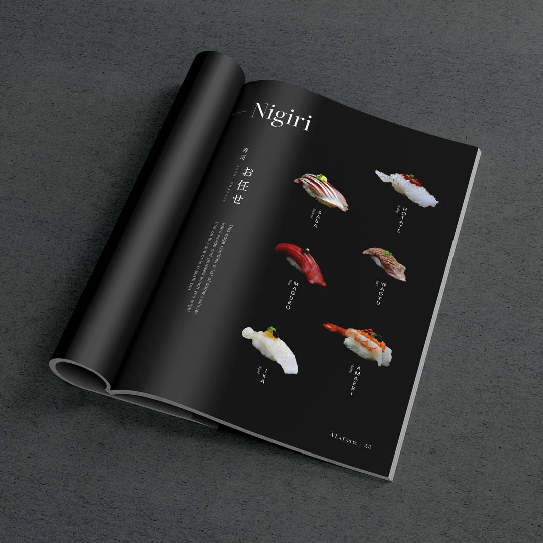
Yōkoso. Tora is privately owned sushi restaurant located in Orlando, FL, and they're not your typical sushi bar. California rolls are not on the menu, and more often than not, they will serve you a plate and say, "No soy sauce." Tora serves omakase and their passion is creating the best possible sushi experience.

"Omakase" means "to you I entrust" in Japanese, and the chef personally crafts a full-course meal tailored to you. It may not sound too complex at first, but there are many small details to consider. For example, where you're from or the size of your mouth can determine the ingredients and sizing of your meal. It is a delicate art with many variables that requires years of practice.

Project Scope
  • Strategy
  • Identity Design
  • Collateral

Our Challenge

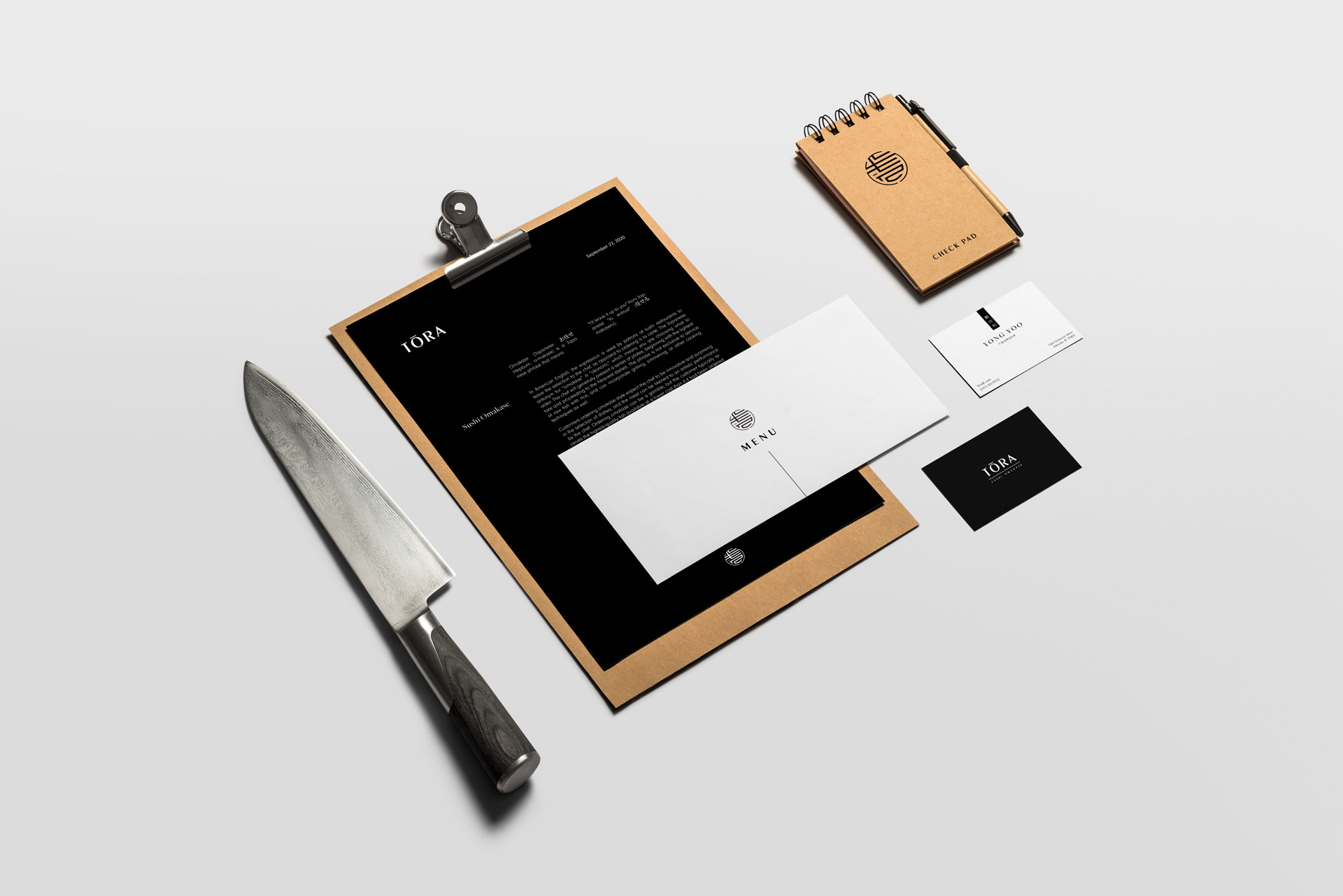
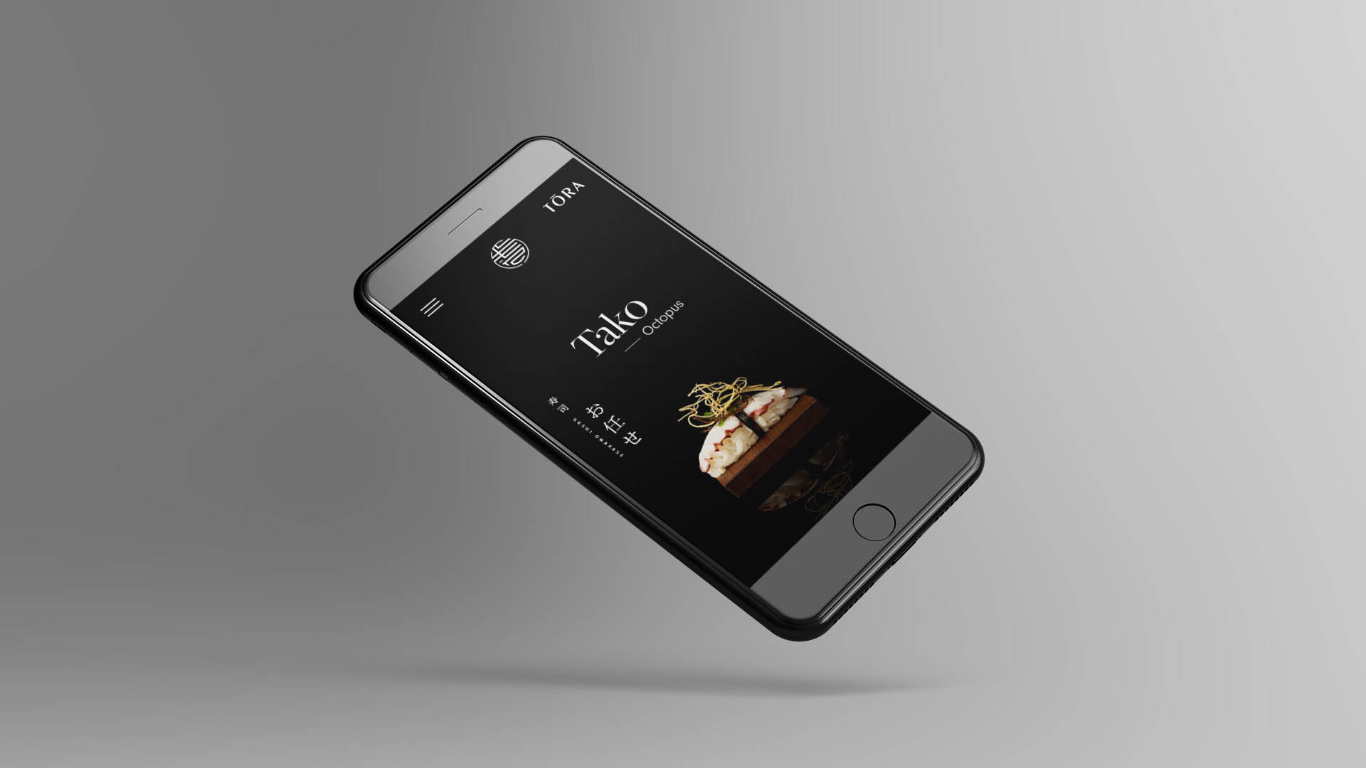
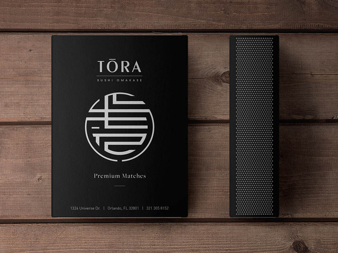
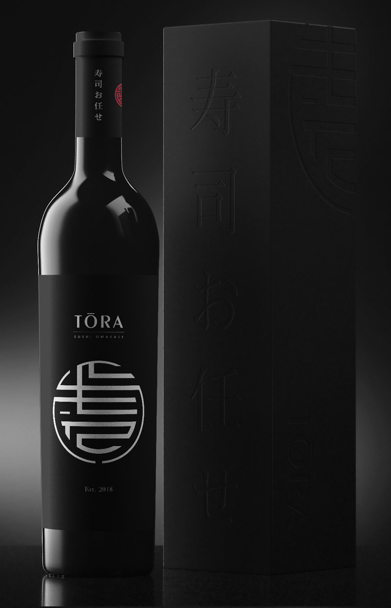
These sushi masters needed a versatile identity system that could accurately represent their culture while speaking to their customers. From printed menus to their online presence, the mark had to adapt across all touchpoints while embodying their practice of omakase: Tradition and mastery in simplicity.

Uncovering the Brand

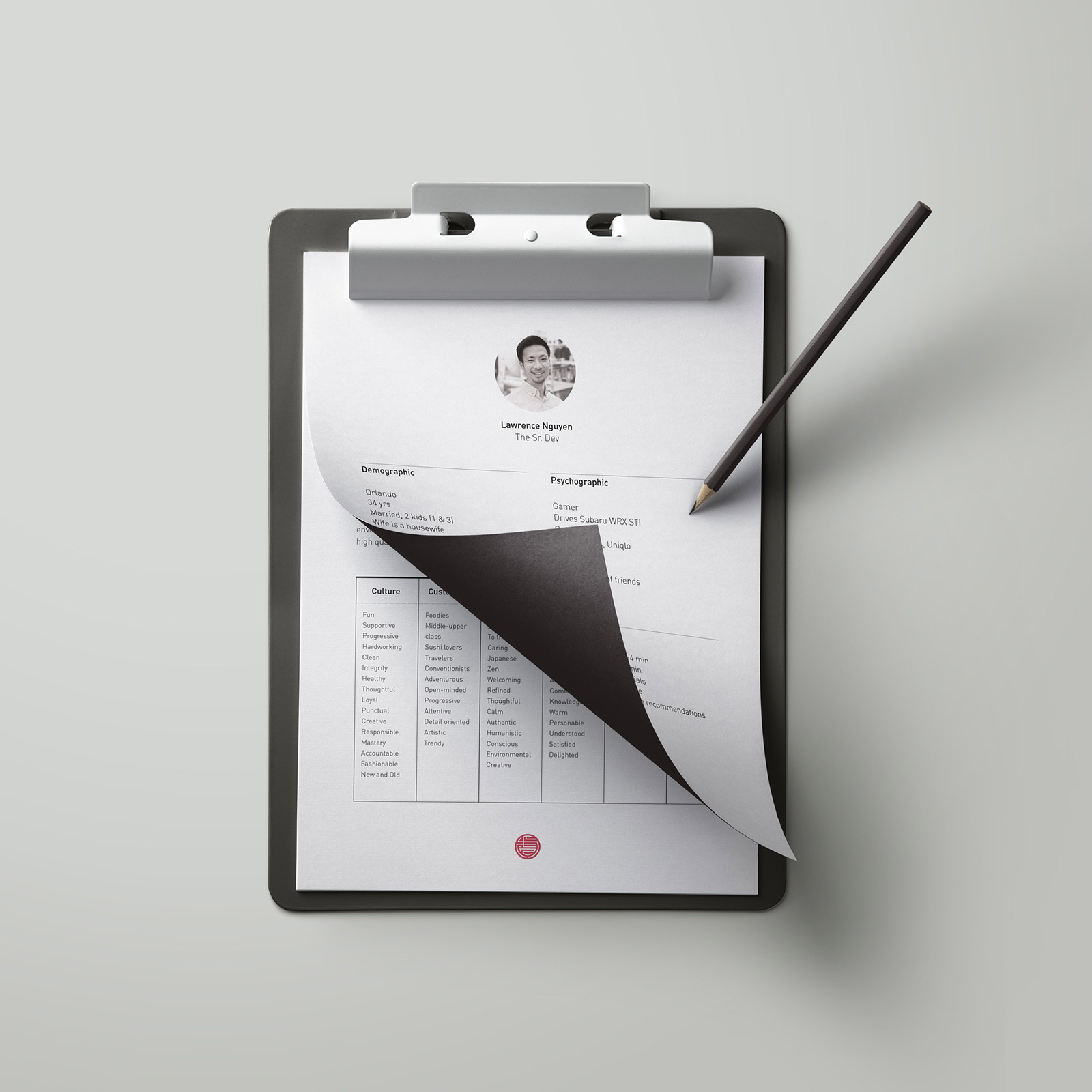
Before diving straight into design, we faciliated a small discovery session with Yong and Taisei, Tora's Executive Chef and General Manager. Through a series of exercises we defined Tora's affinities, personality, culture, and values. We then created a series of user profiles to gain insights into the needs and expectations of their ideal customers.

The top attributes we discovered were simplified down to the theme Neo-Classic, which became the driving force behind all our aesthetic decisions moving forward.

Neo + Classic
Traditional
Minimal
Elegant
Chic
Authentic
Bold
Sleek
Luxurious

Designing the Mark

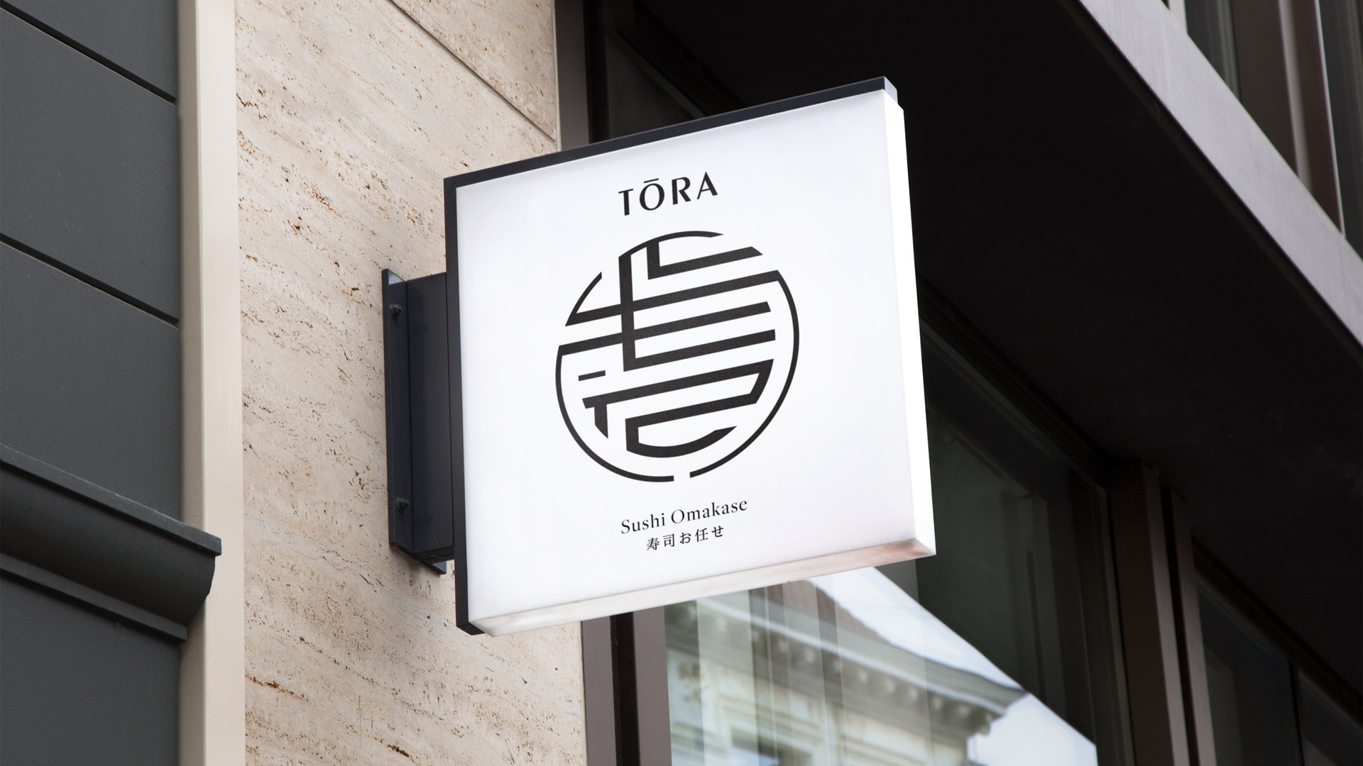
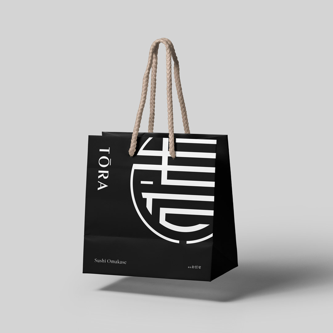
Tora is the word 'tiger' in Japanese. The logo mark was inspired by a combination of a few different elements: the complex art and intricacies of omakase, an ancient kanji tiger seal, the varying line widths of a tiger's stripes, and the circular form of a sushi roll.

Choosing the Right Type

We selected a typeface that was sleek and elegant but still felt traditional without the use of serifs. 'Peignot' by A.M. Cassandre was a perfect fit with the typeface's varying line widths and balance of sharp with smooth.

Credits

Client
  • Tora Sushi, LLC
Executive Chef
  • Yong Yoo
General Manager
  • Taisei Haruna
  • Studio
  • &Y? Design
  • Strategy
  • Messaging
  • Art Direction
  • Design
  • Andrew Shon